Once again voted one of the world's top ten elearning movers and shakers, Upside Learning founder Amit Garg gives us some great insight into designing elearning for multiple devices.
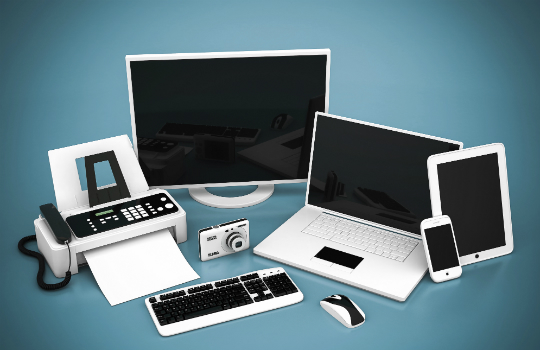
The way we learn today has been revolutionised by the advancements in technology and the devices we use. Elearning, which was instituted on desktops, has now gradually shifted its base to tablets, phablets and smartphones evolving into mLearning and multi-device learning. Today we have an average of 2.9 devices per person and, research predicts, by 2017 this will go up to 5.2! The device most carried is the smartphone at 85%, with laptops and tablets at 65% and 48%.
These days people are just as likely to reach for their smartphone or tablet when using a web-based system as they are to use their desktop or notebook, according to Google Insights research. The research also found that, rather than sticking with the one device, people tend to move between devices during different phases of their interaction with the web-based systems. Another study by GfK says that, "as multiple devices become an integral part of our lives, switching between them is becoming standard practice. In both the UK and the US, more than 60% of online adults use at least two devices every day, while a quarter (25%) of online Americans and a fifth (20%) of online Britons use three devices. In both countries, more than 40% sometimes start an activity on one device only to finish it on another".
As said by, Jeffrey Veen, CEO and co-founder of Typekit and author of The Art and Science of Web Design: "Day by day, the number of devices, platforms, and browsers that need to work with your site grows. Responsive web design represents a fundamental shift in how we’ll build websites for the decade to come."
In learning context, the learning content needs to be designed in a way so that it works well on all devices, delivered to the learners via a responsive learning management platform or else we risk alienating a large number of potential users. To meet this multi-device usage and expectation, we now have to design and deliver our materials across different devices, operating systems, browsers, screen sizes and resolutions. And not only does it need to work, it needs to display correctly to ensure an optimal user experience. This is complex, challenging and requires time and effort. So, how to meet this expectation? The answer is through responsive design.
Responsive elearning design
A responsive framework lends itself to the design and development of a single design that is compatible across all possible user devices, enabling learners to access content from the device of their choice. In many cases, this covers the possibility of allowing learners to continue their learning experience while switching between devices based on their points of access and context of usage.
Key characteristics of responsive elearning design:
Learning and performance support interventions delivered from one source to multiple devices with no content loss
Content responds to or moulds itself to devices' dimensions and rearranges itself accordingly
Content changes its form or gets layered where required for a better user experience
These key characteristics also pose some design challenges that primarily include:
Designing layouts based on breakpoints
Selecting the right font (size, type)
Handling images/graphics and animations
Handling interactive and navigation elements
However, once these challenges are handled, from an organisational perspective, the key benefits that responsive elearning can bring are:
A single source solution which is cheaper to create and manage
Enhanced reach to the mobile workforce, and increased uptake
Ability for employees to access elearning on their own devices
Ability for employees to access elearning outside office hours including during travel and waiting times
Making (compliance) training programs more convenient to complete
Ability to track the elearning program completions, or results across device types
Ability for employees to continue their learning experience from one device to another through bookmarking via an LMS
Multi-device testing
Once the elearning has been developed, the next step is to test the content being presented, the layout and the functionality. On a wide variety of device-OS-browser combinations, on simulators and emulators, and most importantly, on 'physical' devices – in the real environment, on the appropriate hardware. Testing on both the simulator/emulator as well as the real 'physical' devices is necessary to maintain strong standards and quality assurance.
The five key considerations that can help in testing multi-device/ responsive projects are:
Defining the testing target environment and approach
Creating a testing matrix
Checking the availability of physical devices
Test, test, and re-test
Issue logging
Some of the key tools and simulators to test multi-device elearning are:
- Synchronous testing tools
Synchronised testing tools help in performing the same interaction automatically across a number of devices and browsers at the same time. GhostLab, Adobe Edge Inspect, Remote Preview, Grunt + Live-Reload and Emmet LiveStyle are some Mac/ Windows/ Linux based Synchronous Testing Tools.
- Simulators
Simulators create a virtual environment or object which can be a physical system or an object. Simulators come with both the hardware and the software which runs on it to create the real experience. BrowserStack and Crossbrowsertesting.com allow web-based Cross-browser testing. There are a few services that offer desktop browsers testing such as Browserling, however, currently they don’t offer mobile browser testing.
Then there are SDK Simulators, which are local simulators, can also be helpful for testing some parameters. The iOS and Windows simulators allow to check content, alignment, and layouts quite reliably. However, at present the Android emulator is a bit imprecise.
Amit Garg is director and co-founder of Upside Learning


